Same copy. Same product. Different design.

At The Ayurveda Experience (TAE) we run performance marketing driven ads and long form sales pages. This is an example of landing page CRO redesign I did for ViewRyt an eye supplement by TAE.

Team1 Designer (me) · 1 Copywriter
BrandThe Ayurveda Experience — 2.1M customers, 25+ countries
ProductViewRyt — eye supplement
The Product
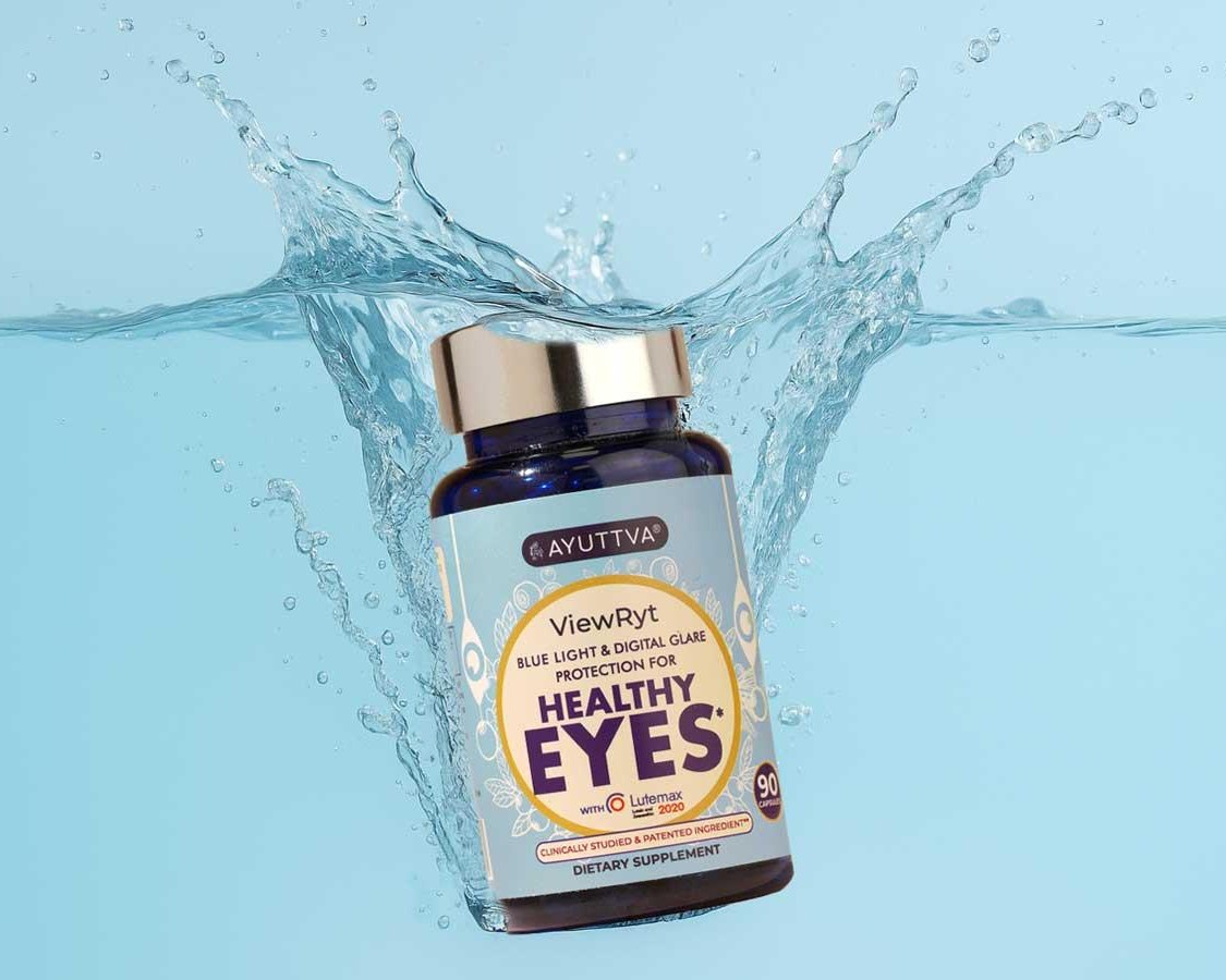
ViewRyt eye supplement bottle by The Ayurveda Experience

Strong product, right audience.

ViewRyt is an eye supplement formulated by TAE scientists, inspired by the industry-standard AREDS 2 formula for macular health.

TAE has strong targeting for women 50+ in the US as a natural skincare brand, and the product was deemed a strong fit.

The Problem

The old pages converted below 1.5%.

ViewRyt carries the full AREDS 2 formula — the NIH clinical standard shown to reduce advanced risk by 25%. A genuinely strong product.

The product wasn't the problem. The page's decision architecture was.
Finding 01Improper hierarchy

A single heading size throughout, body type larger than the subhead, and all attention pulled to one photo.

Finding 02Cognitive overload

Dense information hit visitors before the first CTA — thinking hard before caring at all.

Finding 03Poor targeting

The imagery represented the target audience but never connected emotionally — it read as synthetic stock, not lived experience.

Finding 04Style inconsistency

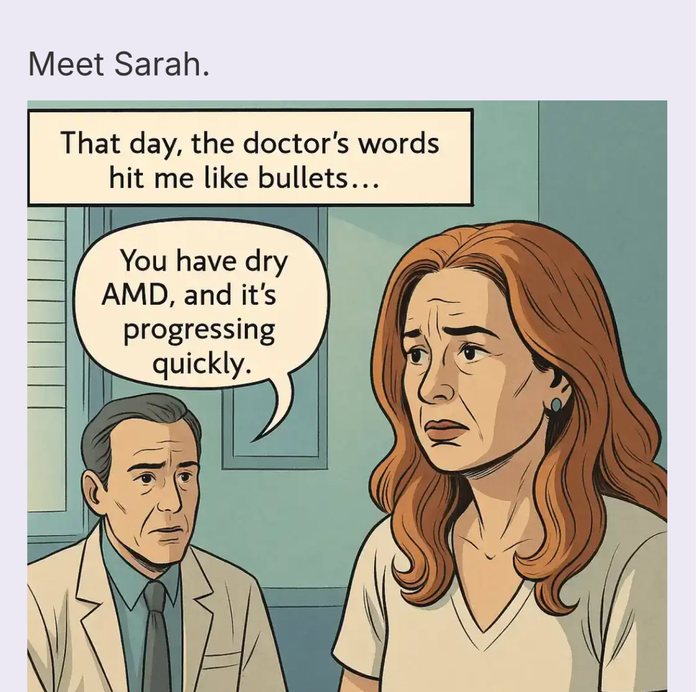
Comic illustration sat beside photography, shadows appeared at random, and the color palette had no through-line.

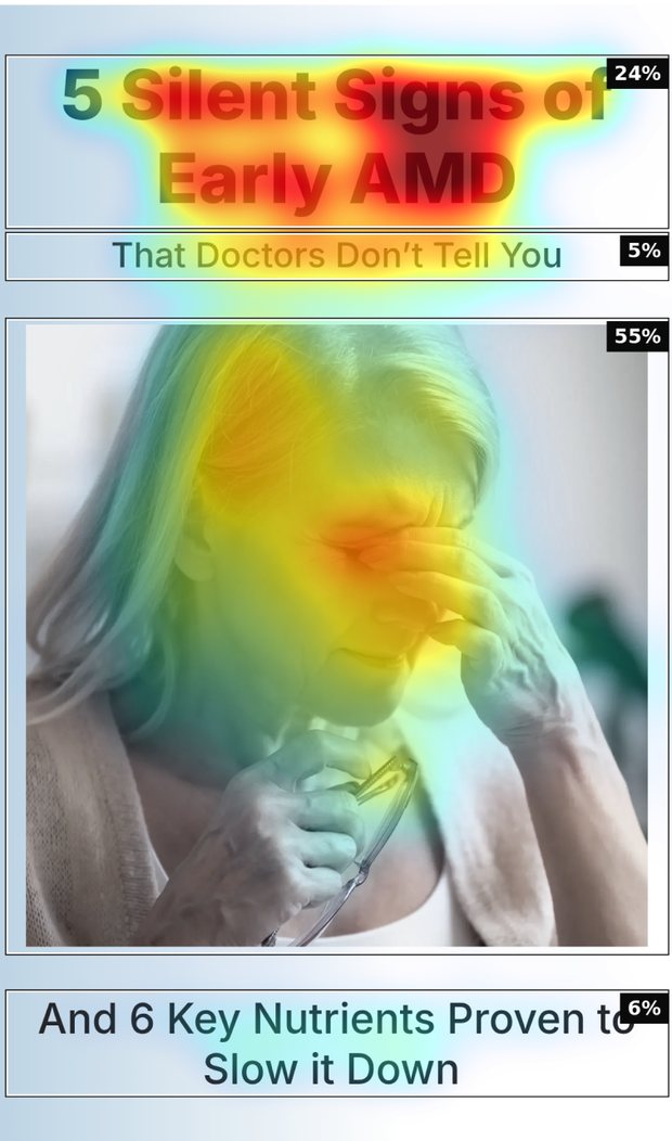
Nothing in the type scale separates a claim from a caption — the body copy even reads larger than the subhead above it.
The heatmap puts 55% of attention on the photo and only 5% on the subhead carrying the promise.
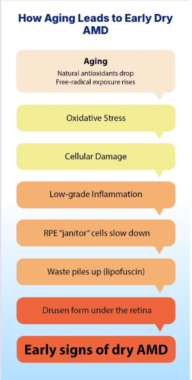
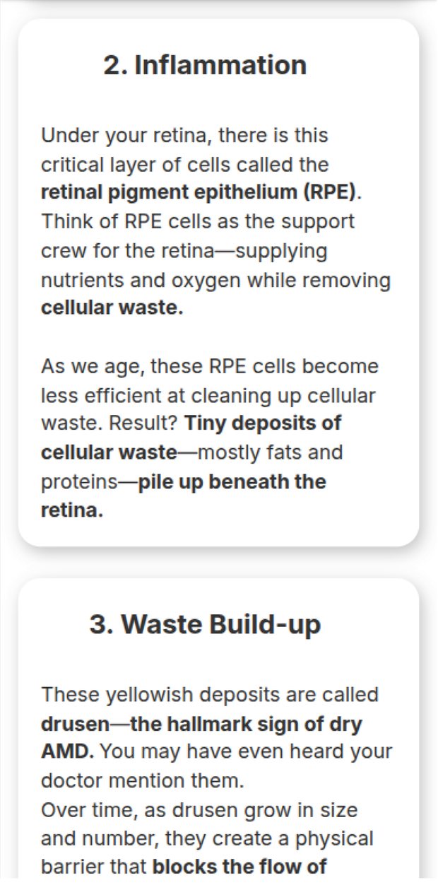
Copy itself is very dense and technical, which needed simpler illustrations.
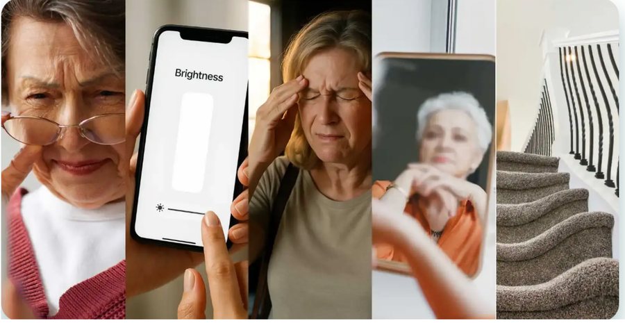
Stock models and synthetic imagery represented the audience age group, but didn't feel emotionally connecting.
Unnecessary drop shadows on elements, comic illustrations and a broken colour palette all needed to be fixed.
NLP7 hero as shipped: headline, subhead and photo Attention heatmap of the same hero showing 55% of attention on the photo and 5% on the subhead NLP7 eight-step flow chart explaining how aging leads to early dry AMD NLP7 long-form cards headed Inflammation and Waste Build-up NLP7 symptom strip: five unrelated stock photos of older women placed side by side NLP7 hero photo: a stock image of an older woman pinching the bridge of her nose NLP7 benefit card with a circular photo sitting on a heavy drop shadow NLP7 Meet Sarah section rendered as a comic illustration
Finding 01Improper hierarchy
Finding 02Cognitive overload
Finding 03Poor targeting
Finding 04Style inconsistency
Principles

Four rules for the redesign, copy untouched.

Keeping the copy identical made the test honest: whatever moved, design moved it. NLP8 was built on four principles.

Principle 01

Hook emotionally, then educate — never the reverse.

Principle 02

Design the moment of choice, not just the layout around it.

Principle 03

Establish authority before making a single claim.

Principle 04

Detail arrives exactly when the visitor is ready for it.

Improvements

Four principles that did the heavy lifting.
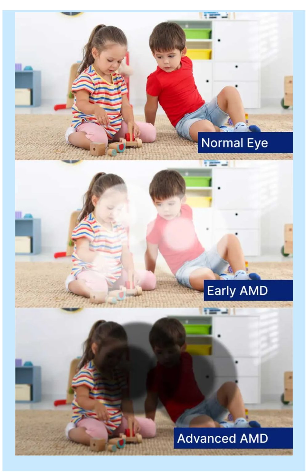
Different stages set against something they truly care about, so the stakes feel real and connect emotionally.
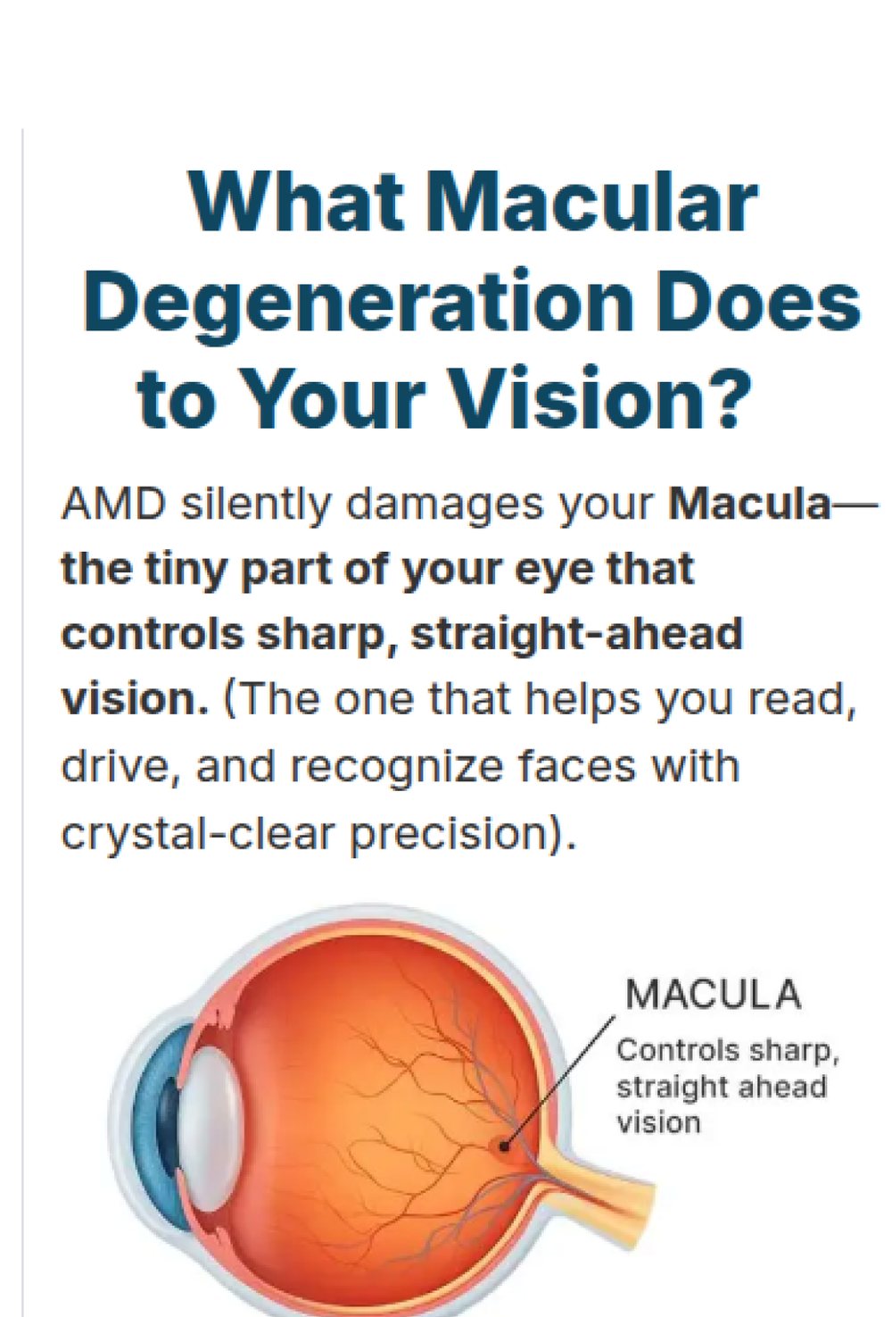
A clean anatomical illustration carries the clinical terms, which keeps the section skimmable.
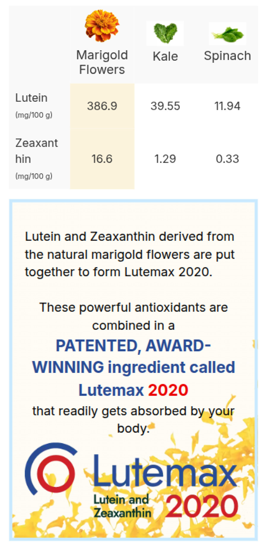
Colour leads the eye from the herb through to the hero ingredient, so the comparison resolves into one answer.
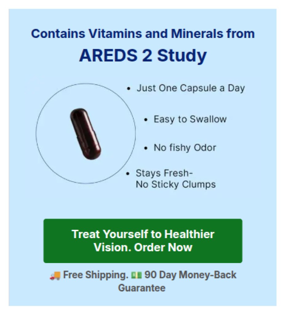
Features, trust and the guarantee are framed in a single screen at the point of decision.
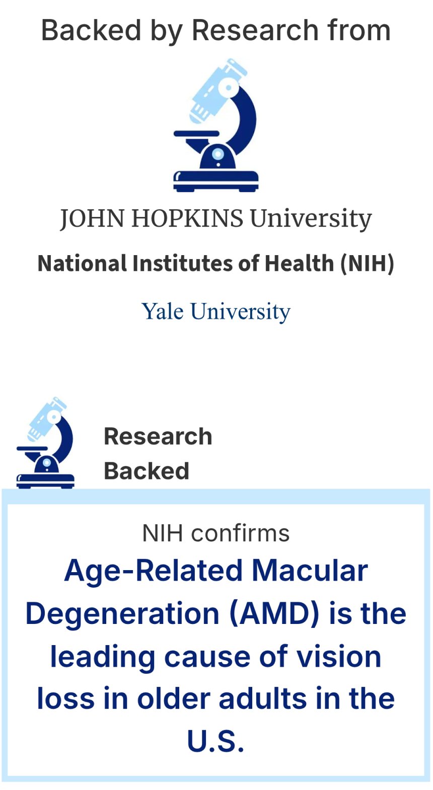
Repetition of elements even above the first claim, so authority is established before anything is asserted.
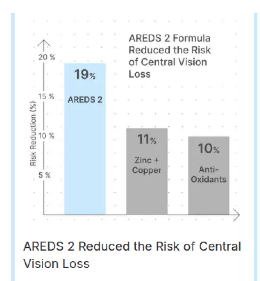
The AREDS 2 result is drawn as a chart instead of stated as a number, which makes the evidence legible at a glance.
A real type scale now separates the claim, the subhead and the supporting line.
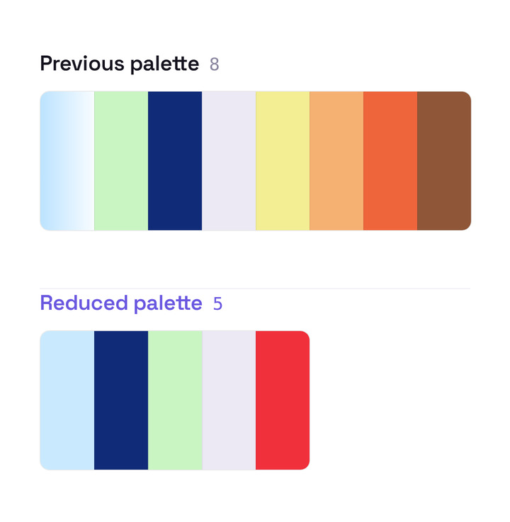
The palette was cut back to five deliberate colours, so nothing competes with the call to action.
Three photographs of the same scene simulating normal, early and advanced AMD vision Explainer section with an anatomical illustration of the eye labelling the macula Lutein comparison table for marigold, kale and spinach above the Lutemax 2020 ingredient panel AREDS 2 product card listing capsule benefits above the order button and guarantee Backed by Research block crediting Johns Hopkins, the NIH and Yale, above an NIH confirmation callout Bar chart showing AREDS 2 reducing risk of central vision loss by 19% against 11% and 10% comparators Revised hero with a clear heading, subhead and supporting line at distinct sizes Swatch strip of the previous eight-colour palette above a visibly shorter strip of the reduced five-colour palette
Improvement 01Attention before explanation
Improvement 02Decision architecture
Improvement 03Trust & evidence
Improvement 04Hierarchy and consistency
The Redesign

The page Walkthrough

This is the shipped new page, exactly as it runs in production. Side notes explain the intent behind each section.


ViewRyt NLP8 redesign — top half of the live landing page ViewRyt NLP8 redesign — bottom half of the live landing page
HookThe lead is a story, not a pitch

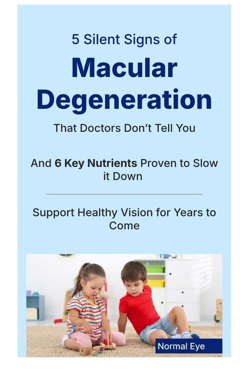
"5 Silent Signs of Macular Degeneration" opens on the fear of losing independence, then explains why vision degrades after 40. Attention is earned before a single claim is made.

EvidenceThe AREDS-2 study leads, ingredients follow

NIH, 10 years, 4,203 participants — then each nutrient card answers "why it matters." Authority arrives before any brand talk.

RevealThe product is the conclusion

ViewRyt only appears once the argument is complete — entering as the obvious answer, with expert endorsements beside it.

CloseThe CTA is a zone, not a button

Verified reviews, a price-anchored comparison and the 90-day guarantee cluster around the click. The decision moment is designed, not decorated.

Results

From losing money on every visit to profitable.

Identical copy, identical product, identical traffic source — only the design changed. The page crossed from spending more than it returned to returning more than it spent. And the compounding effect: Meta's algorithm answered that performance by pushing far more budget through the new page than the old one ever earned.

0.0XConversion rate
0.0XEarnings per visitor
0XAd spend earned from Meta
Aftermath

The Product Aftermath

Next we aimed to raise average order value, since the page ran with a single pack only. But the product was later discontinued: the of this cohort never reached brand benchmarks.
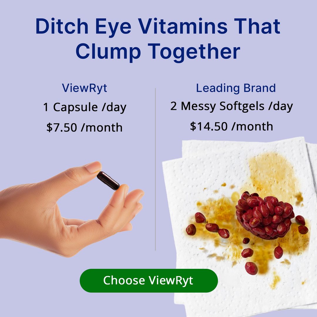
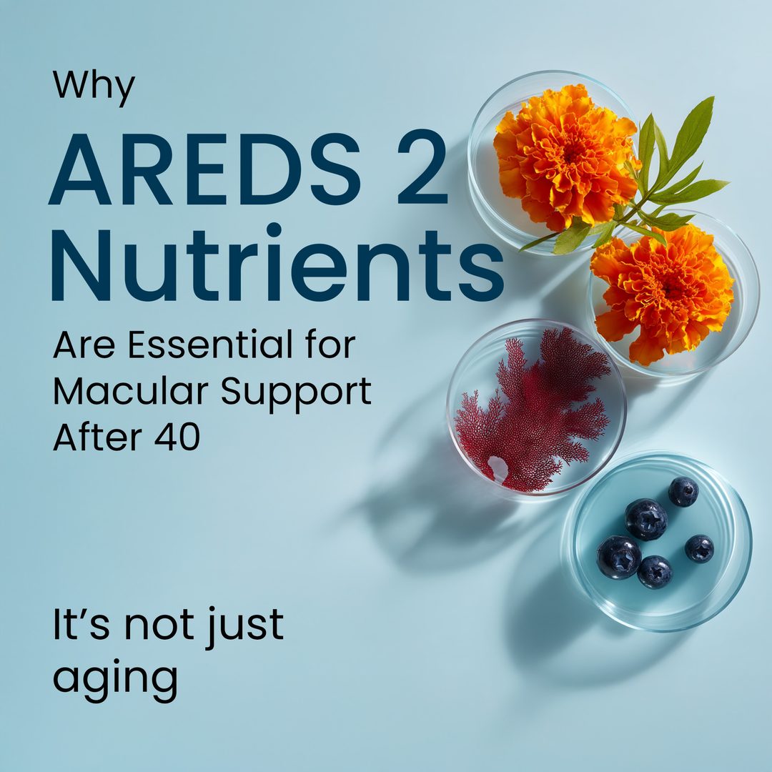
ViewRyt Meta ad: one capsule a day at $7.50 a month versus two messy softgels at $14.50 ViewRyt Meta ad: a capsule filled with marigold flowers, headlined Lutein and Zeaxanthin ViewRyt Meta ad: Blurry Vision does not equal Just Aging, over a photo of grandchildren at play ViewRyt Meta ad: Why AREDS 2 nutrients are essential for macular support after 40
Creatives that ran against this page on Meta.